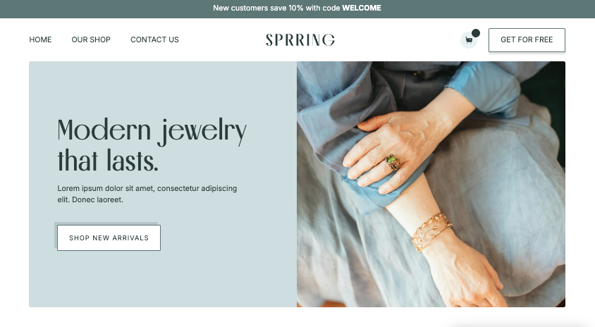
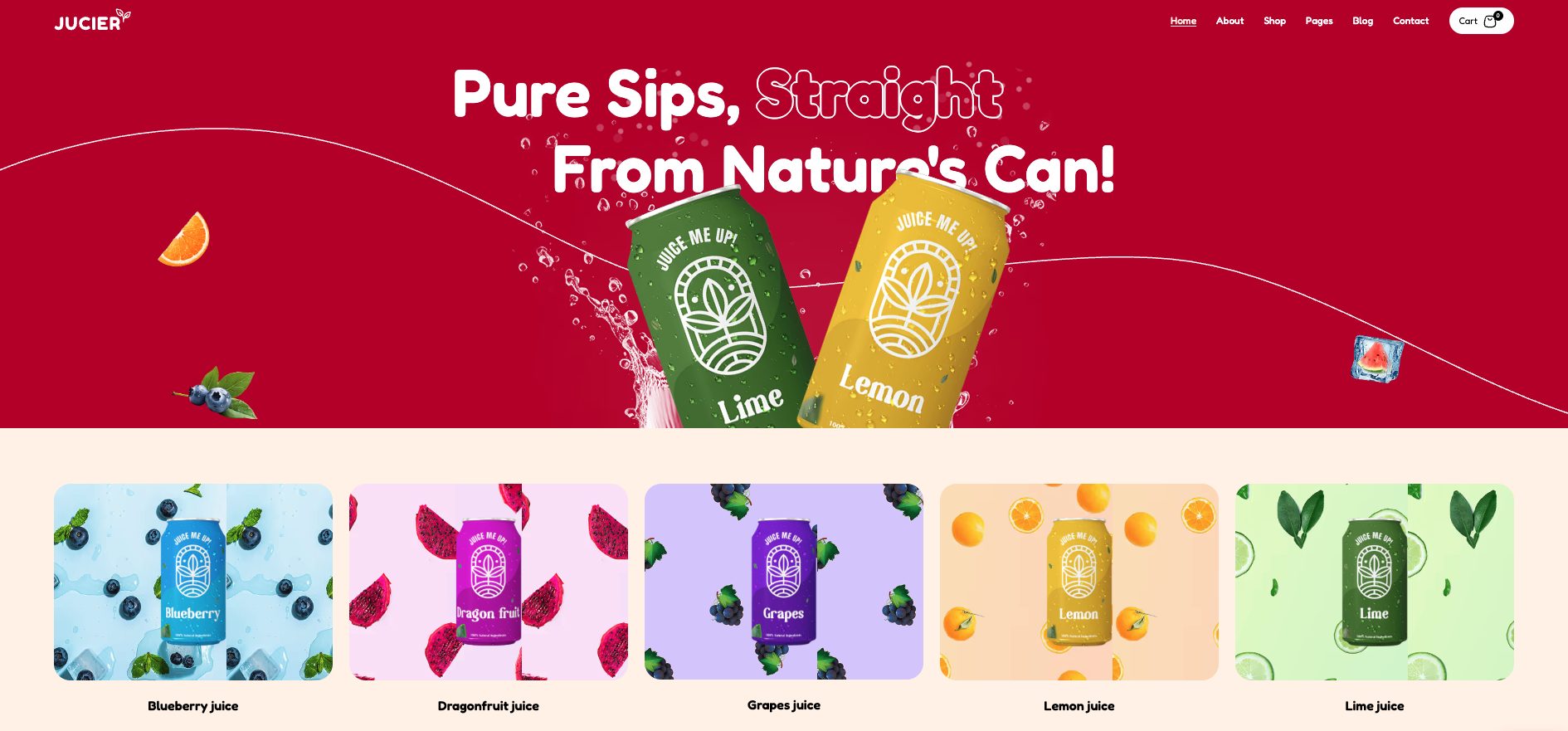
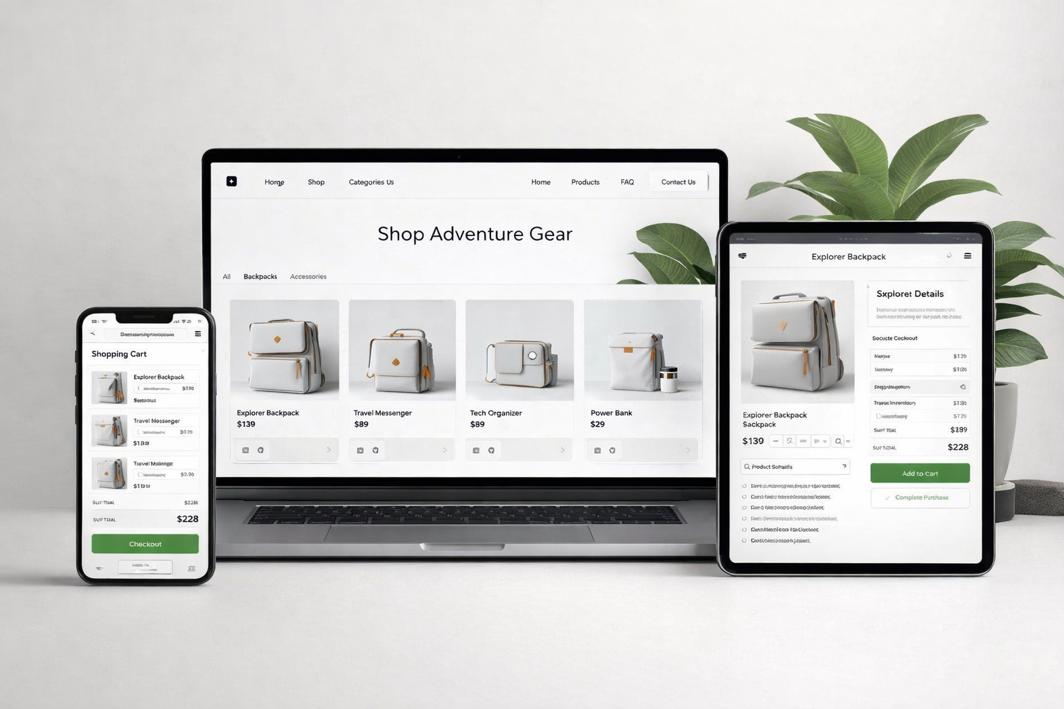
Most websites fail. Not dramatically—they don't crash or break. They just sit there, looking professional, generating almost nothing.
We've audited hundreds of creator and small business websites. The pattern is always the same: beautiful design, zero conversions. The owner paid $5,000-$15,000 for a digital business card that doesn't bring in leads or sales.
The problem isn't design. It's architecture. Most web designers optimize for aesthetics. We optimize for conversions. After 100+ builds and millions in tracked revenue, we've identified exactly three elements that separate websites that convert from websites that don't.
Element 1: A Single, Unmistakable Action
Here's what we see on 90% of websites we audit:
- "Learn More" button in the hero
- "Contact Us" in the nav
- "Subscribe to Newsletter" in the sidebar
- "Follow on Instagram" in the footer
- "Book a Call" floating somewhere
Five different actions competing for attention. The visitor's brain freezes. They do nothing.
The conversion principle: Every page should have one primary action. Not two. Not "options." One.
This doesn't mean you can't have secondary actions—but they should be visually subordinate. Your primary CTA should be obvious, repeated, and impossible to miss.
How we implement this:
For a creator selling digital products:
- Primary action: "Get the Course" (appears in hero, after social proof, after benefits, in sticky header on scroll)
- Secondary action: "Join Free Newsletter" (appears only after primary CTA, smaller button, different color)
For a service business:
- Primary action: "Book a Free Consultation" (hero, after case studies, after FAQ, sticky footer on mobile)
- Secondary action: "Download Our Process Guide" (appears mid-page, captures leads who aren't ready to book)
The math is simple: if your primary CTA appears 4 times on the page instead of once, you'll see roughly 2-3x more clicks. We've tested this across dozens of sites.
Element 2: Proof Before Promise
Here's a typical homepage structure we see:
- Hero with tagline and button
- Features/Services section
- About section
- Testimonials at the bottom
- Contact form
The testimonials—the only real proof on the page—are buried at the bottom where 70% of visitors never scroll.
The conversion principle: Social proof should appear within the first viewport, before you ask for anything.
Why? Because visitors don't trust you yet. They just landed on your site. They don't know if you're legitimate. Every claim you make before showing proof is met with skepticism.
The proof hierarchy:
Not all proof is equal. Here's how we rank it:
- Specific results with numbers: "Increased conversions from 2.1% to 7.8% in 60 days"
- Recognizable logos: "Trusted by Mars, Oracle, Deloitte"
- Video testimonials: Real faces, real voices
- Written testimonials with photos and titles: "Sarah Chen, Founder of XYZ"
- Generic testimonials: "Great service!" - Anonymous
If you have #1 or #2, lead with them. Put them directly under your hero headline, before you explain anything else.
Real example from our work:
We rebuilt a coaching website that was getting 0.8% conversion rate. The original structure buried testimonials at the bottom.
New structure:
- Hero headline + CTA
- Logo bar: "As seen in Forbes, Entrepreneur, Inc."
- Results bar: "2,847 students | 4.9 rating | $12M in student results"
- Video testimonial from recognizable client
- THEN the offer explanation
Conversion rate jumped to 4.2%—a 5x improvement. The only change was moving proof above promise.
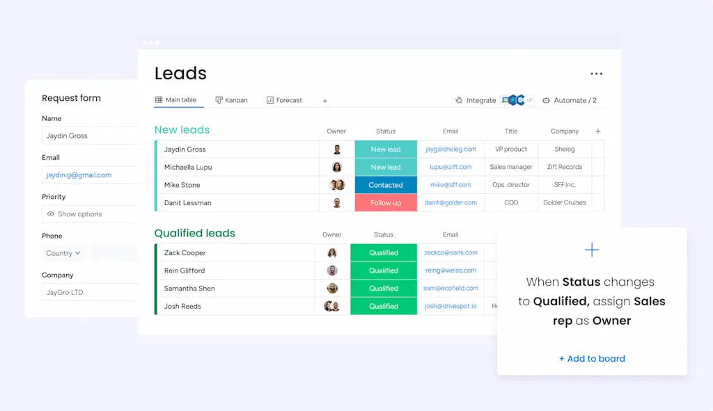
Element 3: Friction-Appropriate Forms
We see two extremes:
Extreme 1: The 15-field contact form asking for name, email, phone, company, company size, budget, timeline, project description, how they heard about you, their mother's maiden name...
Extreme 2: Just an email field with "Subscribe" button—for a $10,000 service.
Both are wrong. The right form length depends on what you're asking for.
The conversion principle: Form friction should match the value of what you're offering and the commitment you're asking for.
Our form framework:
Free lead magnet (PDF, newsletter):
Email only. Maybe first name. That's it. Every additional field drops conversion by 10-25%.
Free consultation booking:
Name, email, phone (optional), one qualifying question. The qualifying question is crucial—it filters tire-kickers and makes your sales calls more efficient.
Paid product ($50-500):
Name, email, payment info. Add a phone field if you need it for delivery.
High-ticket service ($5,000+):
This is where you can ask more. Name, email, phone, company, brief project description, budget range, timeline. You WANT some friction here—it qualifies leads and saves you time on unqualified calls.
The hidden form killer:
Beyond field count, we see forms murdered by:
- CAPTCHA: Adds 10-20% drop-off. Use invisible reCAPTCHA or honeypot fields instead.
- Required phone number: For low-commitment offers, phone fields kill 30%+ of submissions.
- Multi-page forms: Unless you're doing progressive profiling correctly, single-page forms convert better.
- No feedback on submission: People click submit and nothing happens. They click again. They leave. Always show immediate confirmation.
The Interaction Effect
Here's what makes these three elements powerful: they compound.
- Single action + proof above fold = visitors trust the action
- Proof + right form friction = qualified leads who actually convert
- Right form + single action = no confusion, fast completion
When we implement all three on a site that had none, we typically see 3-5x improvement in conversion rate. When we optimize a site that already had one or two elements, we see 50-100% improvement.
What This Means For Your Site
Open your website right now. Ask yourself:
- Single action: Is there one obvious thing I want visitors to do? Does it appear multiple times? Is everything else visually subordinate?
- Proof before promise: Within the first scroll, do visitors see evidence that I'm legitimate and deliver results?
- Friction-appropriate forms: Are my forms matched to what I'm asking for? Am I asking for too much too soon, or too little for high-commitment offers?
If you answered "no" to any of these, you have a concrete starting point for improvement.
These aren't trends. They aren't hacks. They're fundamental principles of how humans make decisions online—and they won't change next year.
The Bottom Line
Most websites fail because they're built by designers who optimize for aesthetics, not by strategists who optimize for conversions.
A beautiful website that doesn't convert is an expensive decoration. An ugly website that converts is a money machine. The best websites are both—but if you have to choose, choose conversions.
Start with these three elements. Nail them before you worry about animations, custom illustrations, or whatever design trend is popular this month.
Fundamentals first. Always.


